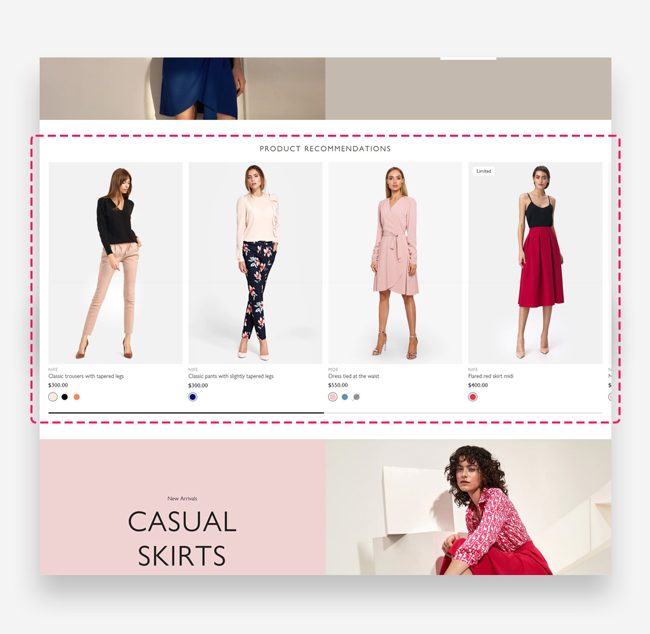
What is the Product recommendations section?
The Product Recommendations Section is a curated showcase designed to enhance the shopping experience by suggesting items that complement the customer's current browsing or previous purchase history.
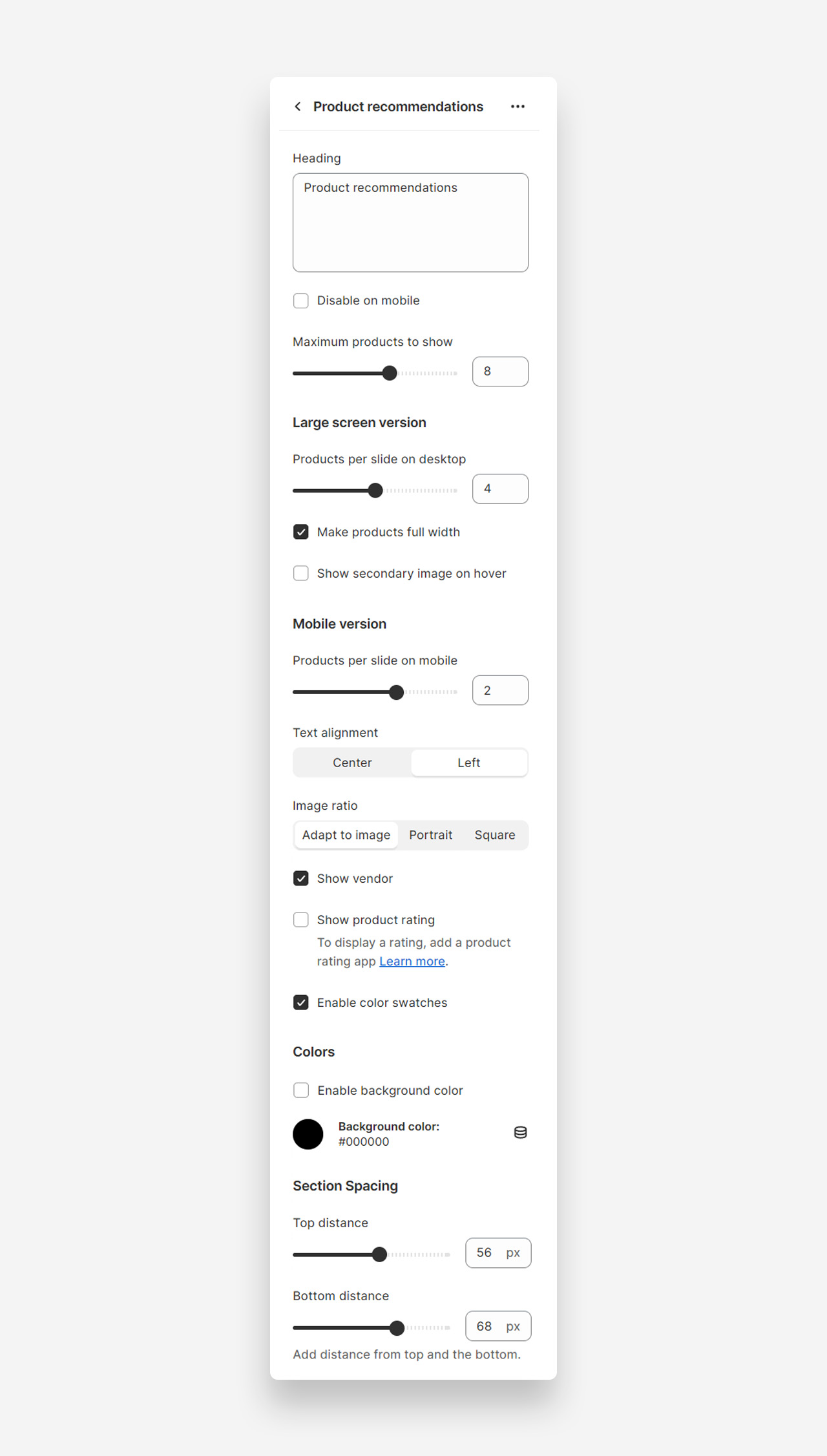
Main settings
- Heading: Customize the header of the section to encapsulate the essence of your recommended products. This title sets the stage for the curated selection that follows.
- Disable on Mobile: Toggle this option to hide the product recommendations on mobile devices, ensuring a cleaner and more focused shopping experience for users on the go.
- Maximum Products to Show: Adjust the slider to set the total number of products displayed within the recommendations carousel, allowing you to control the variety without overwhelming the customer.
- Products per Slide on Desktop: Determine how many products to display per slide on desktop views. This slider allows you to balance detail and breadth, ensuring each product has adequate visibility.
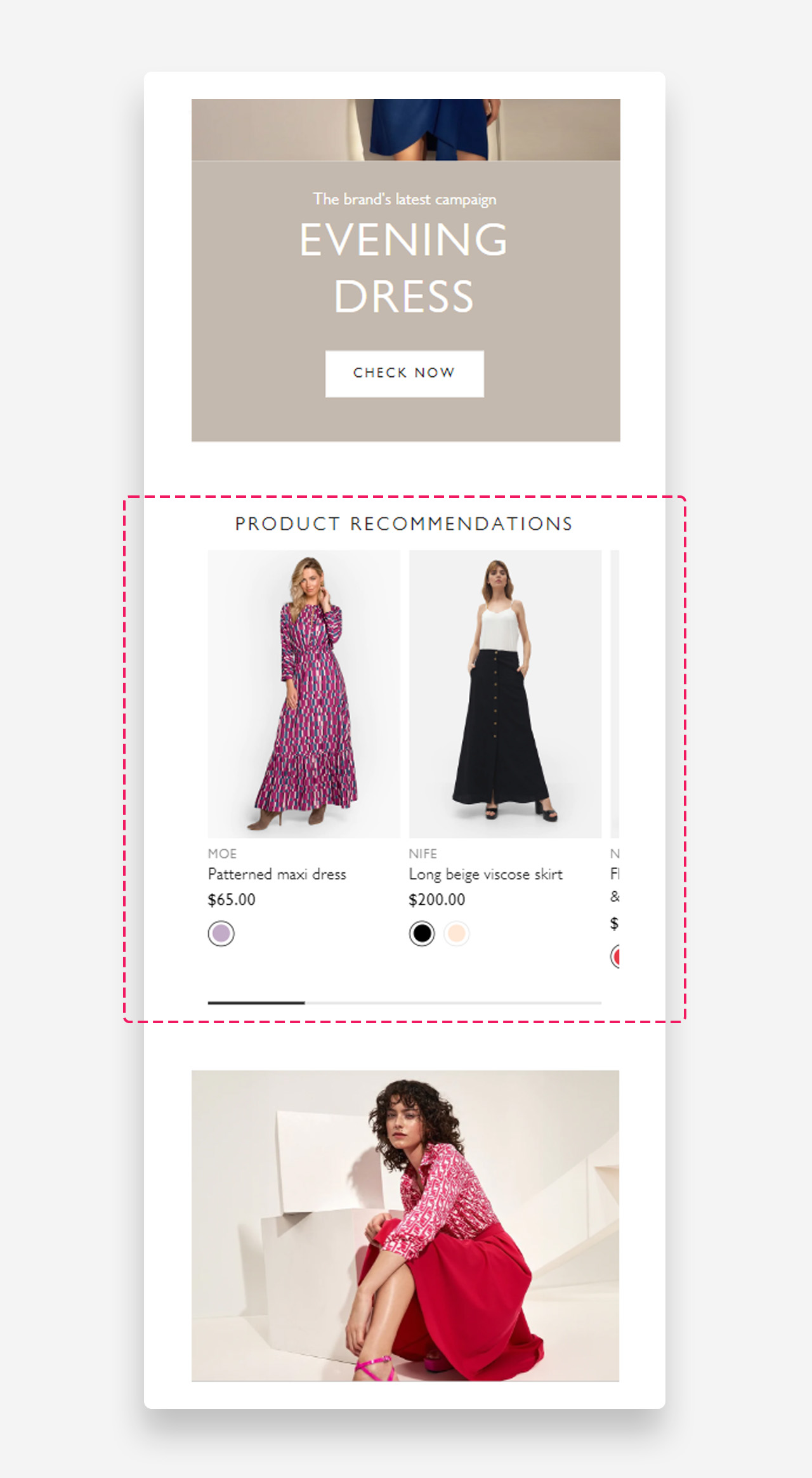
- Make Products Full Width: Check this to span the product images across the full width of the screen, offering an expansive and bold presentation on larger displays.
- Show Secondary Image on Hover: Enable this to reveal a second image when customers hover over a product, providing an interactive way to view more details without leaving the section.
- Products per Slide on Mobile: This slider adjusts the count of products displayed in a single slide within the mobile carousel. Tailor the number to ensure optimal visibility and scrolling on handheld devices.
- Text Alignment: Choose the alignment of the product titles and descriptions to best suit your design. 'Center' gives a balanced look, while 'Left' aligns text to the traditional reading flow.
- Image Ratio: Select the preferred aspect ratio for product images to maintain consistency in presentation. 'Adapt to Image' retains the original aspect ratio, 'Portrait' suits taller images, and 'Square' offers a uniform, grid-like appearance.
- Show Vendor: Check this to display the manufacturer or brand name below the product, adding a layer of information that can influence buyer decisions.
- Show Product Rating: Enable this to feature customer ratings on each product, providing social proof and influencing purchasing choices. Requires integration with a product rating app.
- Enable Color Swatches: This option introduces color swatches on the product recommendations, allowing customers to view and select from available colors directly from the carousel.
- Enable Custom Text Color: Toggle this feature to personalize the color of the text in your product recommendations. The hex code allows for precise color matching with your brand's palette.
- Text Color: This shows the current color selection for your text. Input a hex code here to specify the exact hue for product names and details, ensuring readability and aesthetic harmony.
- Enable Background Color: Switch this on to apply a custom color to the background of your product recommendations section, setting a distinctive tone or mood.
- Background Color: Here's where you can define the specific background color using a hex code, offering an opportunity to create contrast or maintain a visual theme.
- Top Distance: Slide to adjust the space above the product recommendations, providing breathing room and a clean separation from other content.
- Bottom Distance: Similarly, this slider controls the space below the section, allowing you to ensure visual balance and flow on the page.
Mobile view example
Was this article helpful?
That’s Great!
Thank you for your feedback
Sorry! We couldn't be helpful
Thank you for your feedback
Feedback sent
We appreciate your effort and will try to fix the article