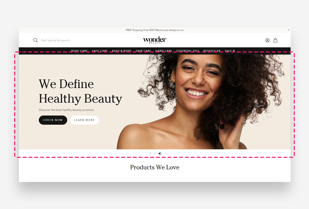
What is the Slideshow section?
The "Slideshow" section is a dynamic display feature for your Shopify store, designed to highlight multiple images, promotions, or stories in a rotating carousel. This visually engaging element can effectively capture customer attention and guide them to different parts of your store.
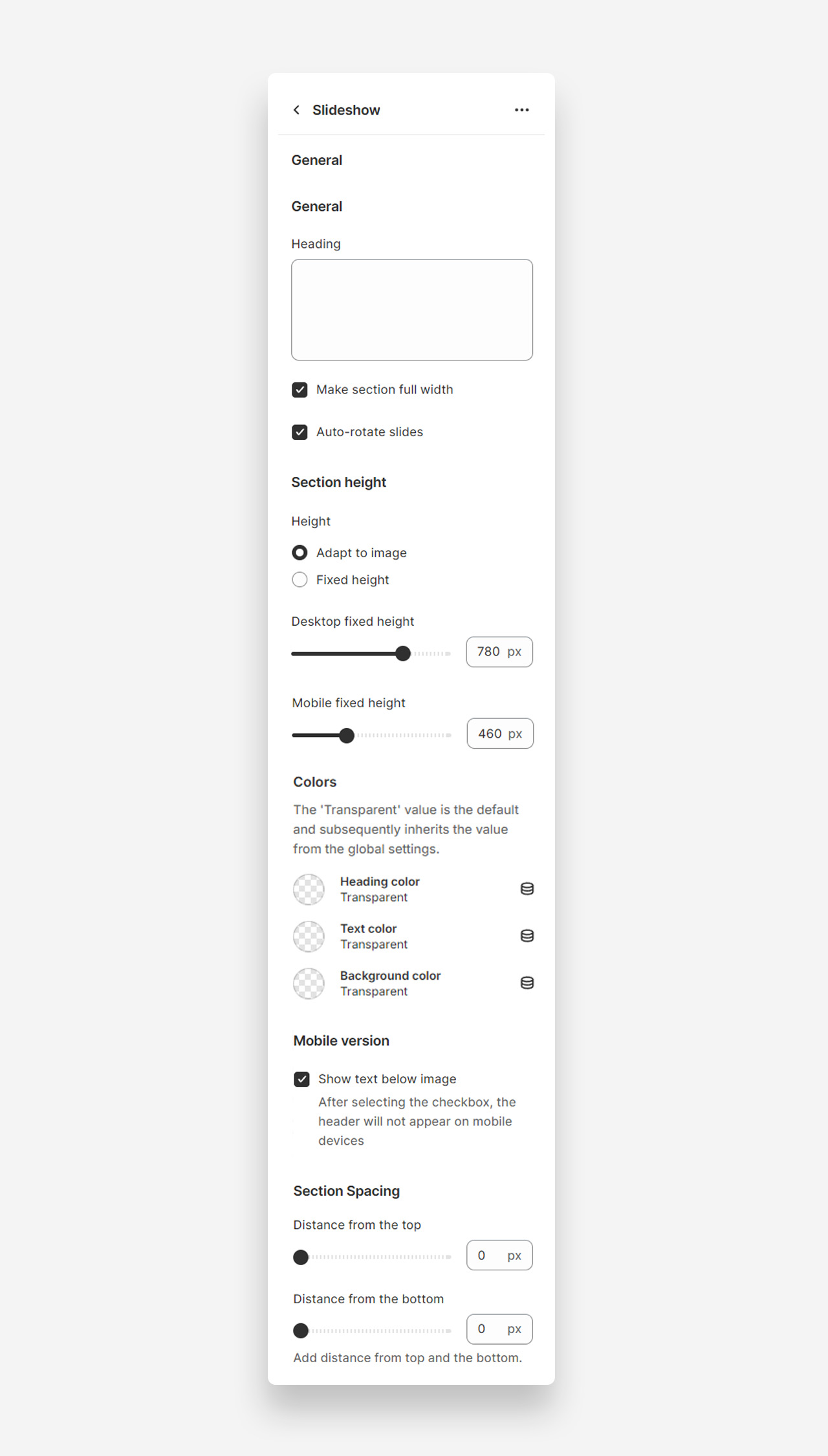
Main settings
Heading
- Heading: Set the title for the slideshow section to introduce the content.
Make Section Full Width
- Make section full width: Enable this setting to make the slideshow section span the entire width of the container.
Auto-Rotate Slides
- Auto-rotate slides: Enable this setting to allow the slides to automatically rotate.
Section Height
Height
- Height: Choose between adapting the height to the image or setting a fixed height.
- Desktop fixed height: Adjust the fixed height for desktop view (default 780px).
- Mobile fixed height: Adjust the fixed height for mobile view (default 460px).
Colors
- Heading color: The 'Transparent' value is the default and subsequently inherits the value from the global settings.
- Text color: The 'Transparent' value is the default and subsequently inherits the value from the global settings.
- Background color: The 'Transparent' value is the default and subsequently inherits the value from the global settings.
Mobile Version
Show Text Below Image
- Show text below image: Enable this setting to show the text below the image on mobile devices.
Section Spacing
- Distance from the top: Adjust the spacing from the top of the section (default 0px).
- Distance from the bottom: Adjust the spacing from the bottom of the section (default 0px).
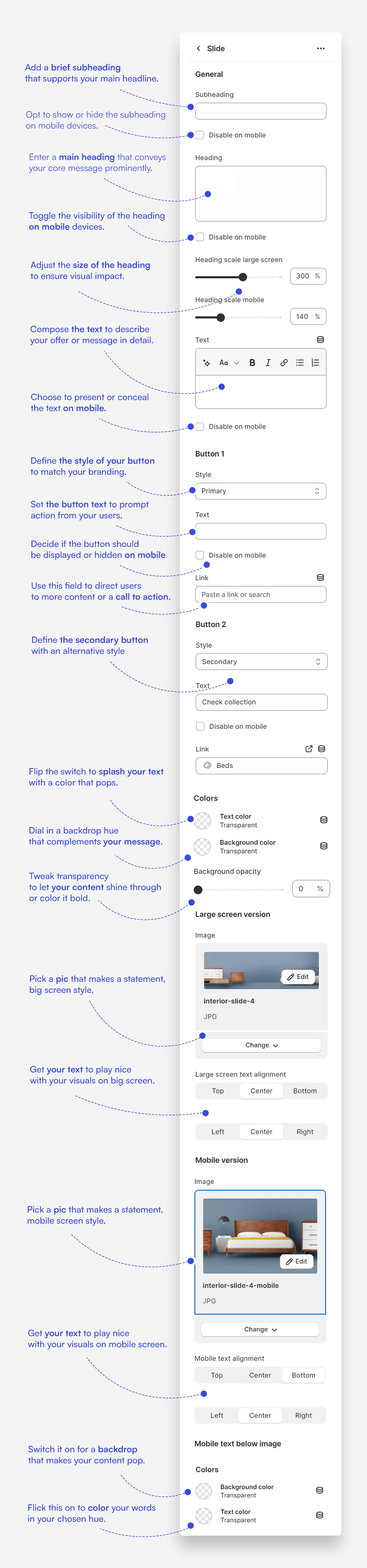
Customize slide blocks
- Subheading: Craft a brief teaser or slogan that introduces the slide's message.
- Heading: Add a prominent title to your slide that captures attention.
- Text: Include descriptive text that tells more about your brand's story or the featured content.
- Button: Customize up to two buttons with your call-to-action text and links to guide customers to desired actions.
- Heading Scale: Adjust the size of the slide heading for both desktop and mobile screens to ensure its impact.
- Image Selection: Choose a compelling image for both the large screen and mobile versions to best represent the slide's content.
- Text Alignment: Decide on the placement of your text for both desktop and mobile layouts for clear readability.
- Custom Text Color: Define the color of your text to maintain visibility and brand consistency.
- Background Color and Opacity: Set the background color and adjust its opacity to enhance the slide's visual appeal.
- Mobile Text Below Image: Opt to show text below the image on mobile devices for a streamlined appearance.
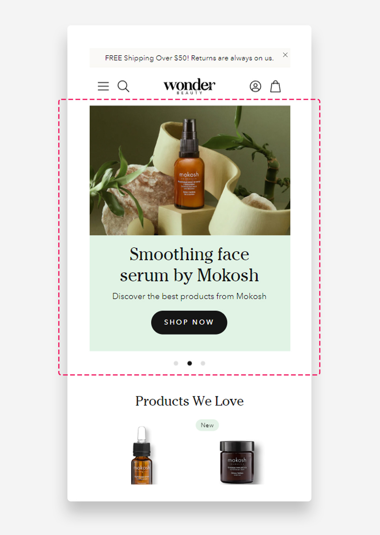
Mobile view example
Was this article helpful?
That’s Great!
Thank you for your feedback
Sorry! We couldn't be helpful
Thank you for your feedback
Feedback sent
We appreciate your effort and will try to fix the article