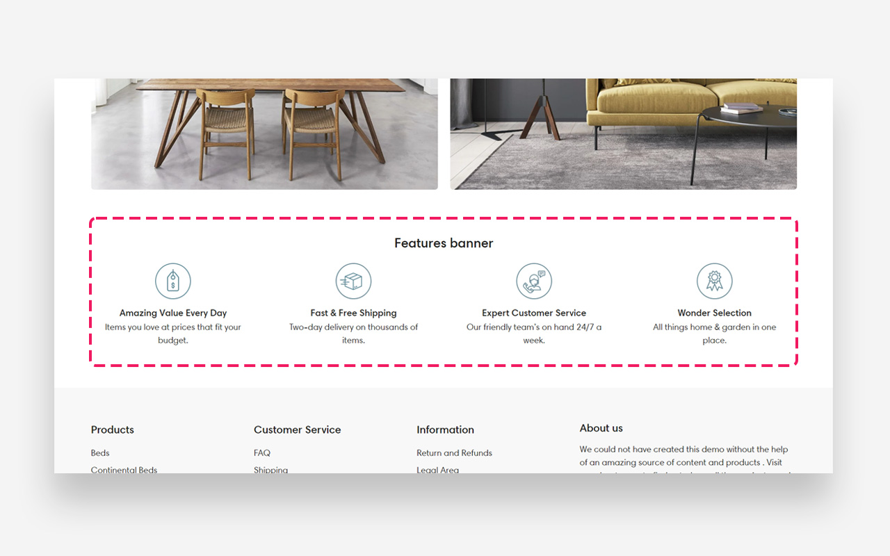
What is the Features banner section?
The "Features Banner" section displays key benefits or offerings in a neat, icon-driven format. Tailor the scale for various screens and adjust colors to match your brand. Perfect for a quick, visual rundown of your store's unique selling points.
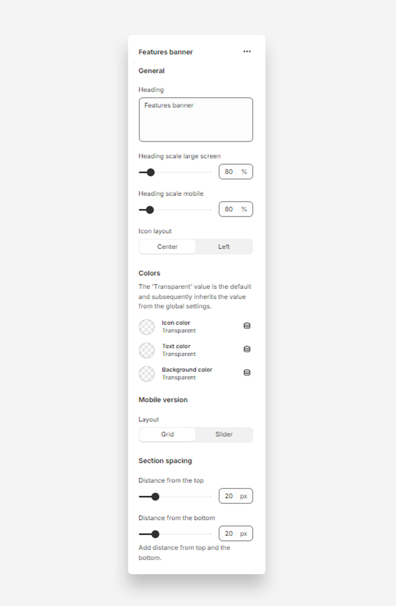
Main settings
Heading
- Heading: Set the title for the features banner to highlight key aspects of your site or products.
Heading Scale
- Heading scale large screen: Adjust the size of the heading for large screens .
- Heading scale mobile: Adjust the size of the heading for mobile screens.
Icon Layout
- Icon layout: Choose the alignment of icons within the banner (options: Center, Left).
Colors
- Icon color: The 'Transparent' value is the default and subsequently inherits the value from the global settings.
- Text color: The 'Transparent' value is the default and subsequently inherits the value from the global settings.
- Background color: The 'Transparent' value is the default and subsequently inherits the value from the global settings.
Mobile Version
Layout
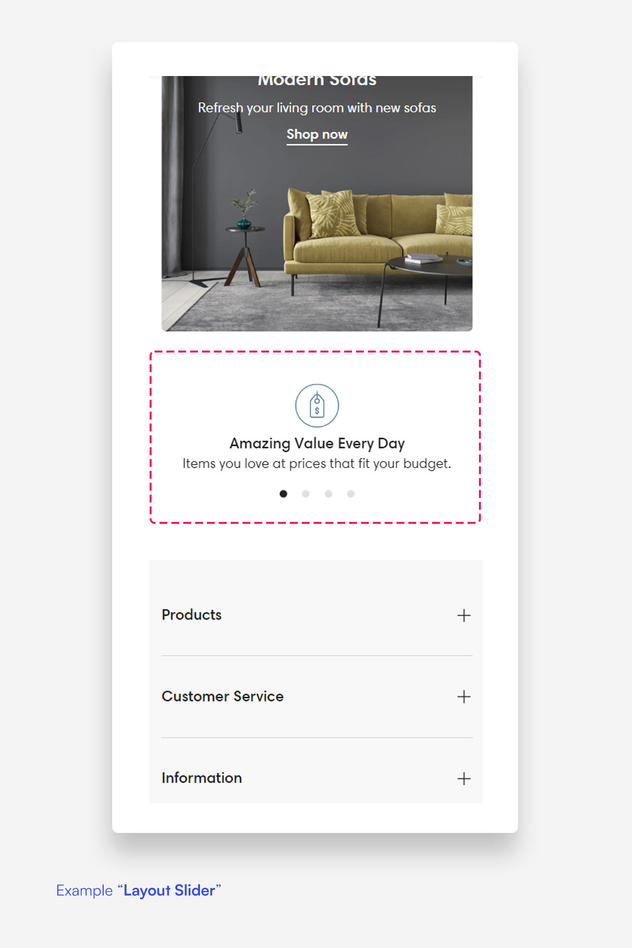
- Layout: Select the layout for the mobile version of the features banner (options: Grid, Slider).
Section Spacing
- Distance from the top: Adjust the spacing from the top of the section.
- Distance from the bottom: Adjust the spacing from the bottom of the section).
Customize icon blocks
Click one of the preloaded icon blocks to customize it.
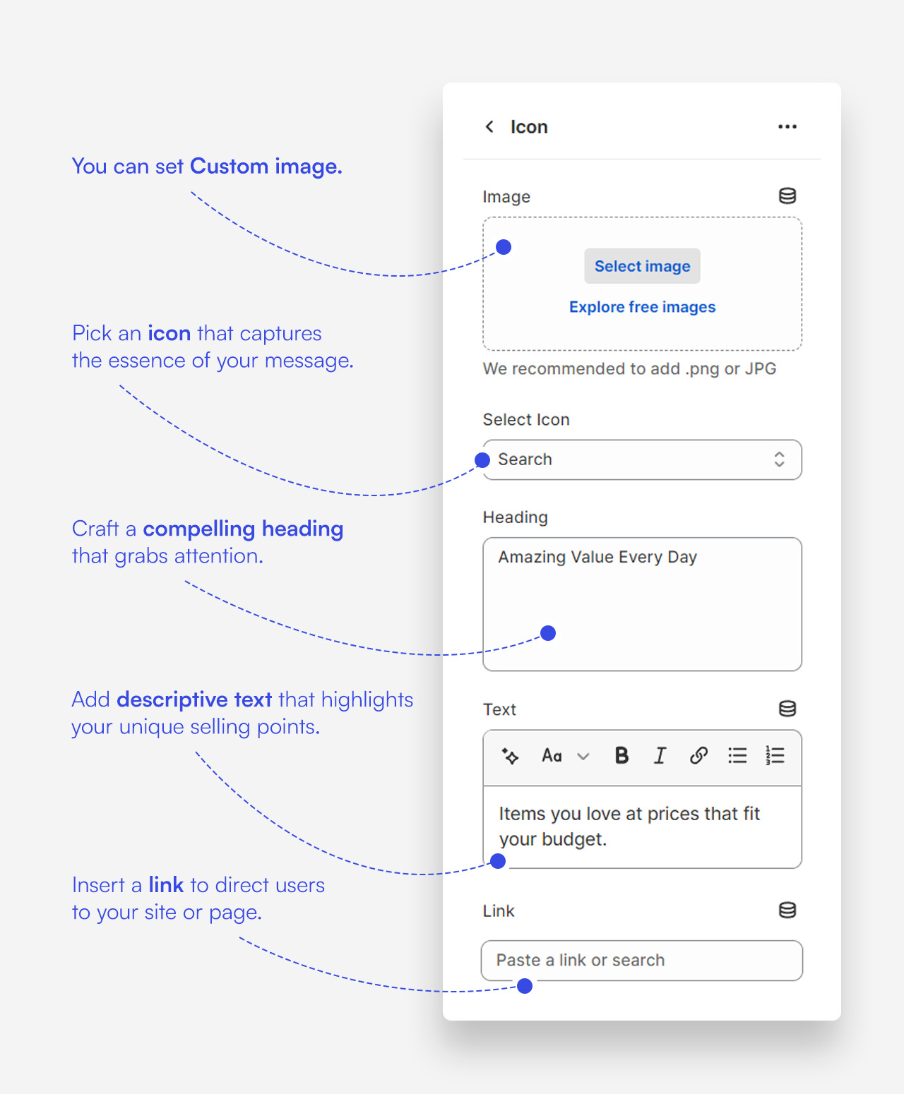
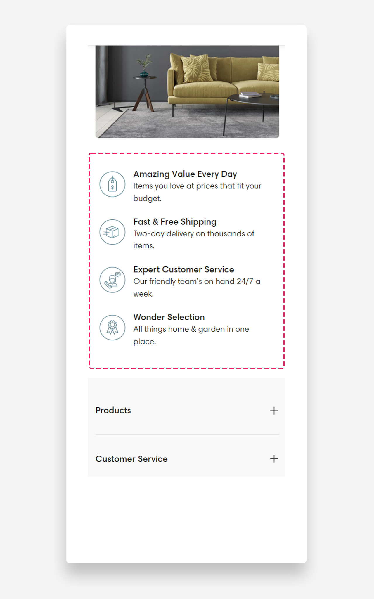
Mobile view example
Was this article helpful?
That’s Great!
Thank you for your feedback
Sorry! We couldn't be helpful
Thank you for your feedback
Feedback sent
We appreciate your effort and will try to fix the article