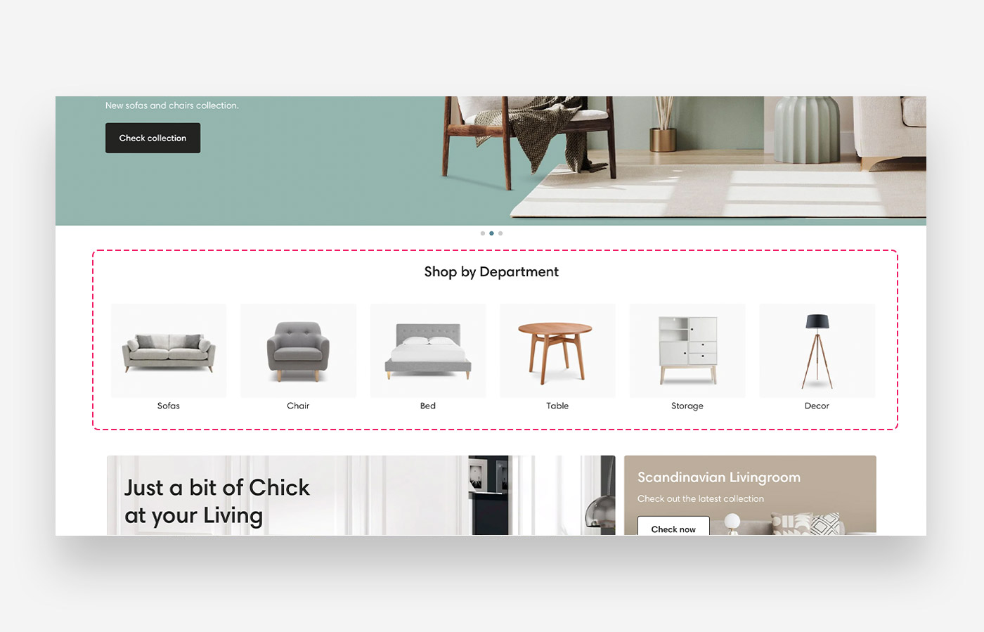
What is the Collection list section?
Collection list sections present new, featured or seasonal collections. You can present up to 12 collections per section.
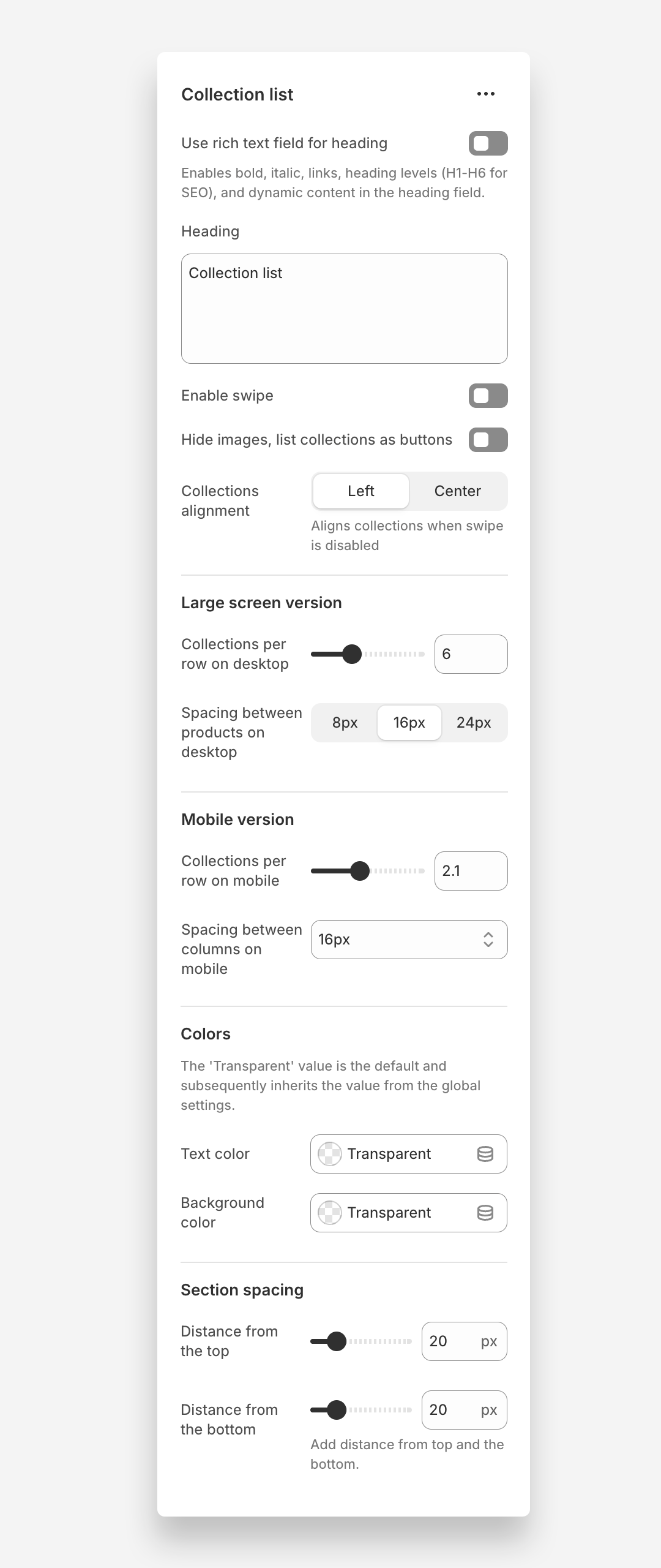
Main settings
Heading
- Heading: Set the title for the collection list to introduce the list of collections.
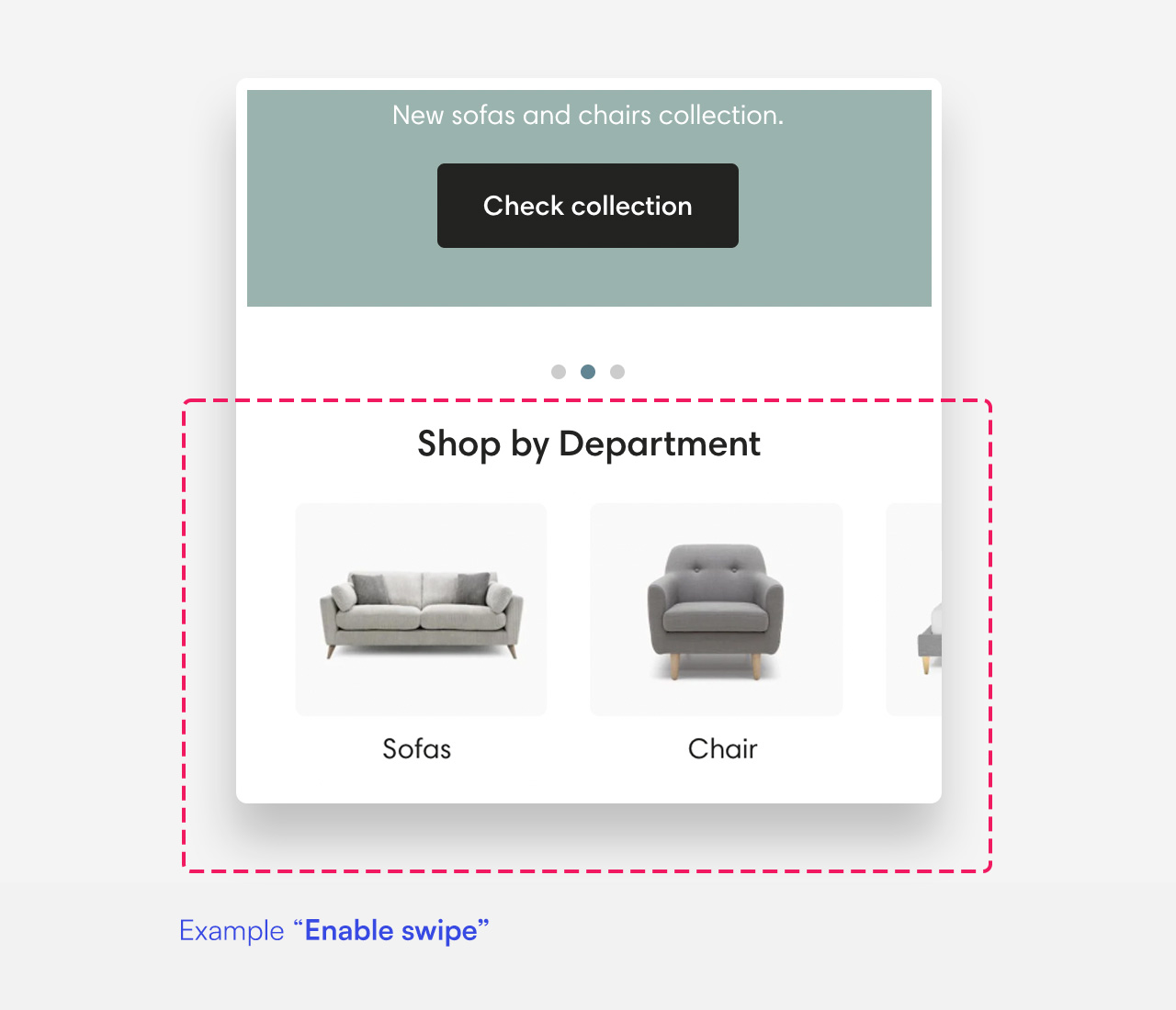
Enable Swipe
- Enable swipe: Enable this setting to allow users to swipe through the collection list.
Collections alignment
- Collections alignment: Choose whether collections are aligned to the left or centered when swipe is disabled
Hide Images
- Hide images, list collections as buttons: Enable this setting to hide collection images and display collections as buttons instead.
Collections Per Slide
- Collections per slide on desktop: Adjust the number of collections displayed per slide on desktop devices (default 4). This setting works only when the 'Enable swipe' setting is enabled.
- Collections per slide on mobile: Adjust the number of collections displayed per slide on mobile devices (default 2.1). This setting works only when the 'Enable swipe' setting is enabled.
Colors
- Text color: The 'Transparent' value is the default and subsequently inherits the value from the global settings.
- Background color: The 'Transparent' value is the default and subsequently inherits the value from the global settings.
Section Spacing
- Distance from the top: Adjust the spacing from the top of the section (default 20px).
- Distance from the bottom: Adjust the spacing from the bottom of the section (default 20px).
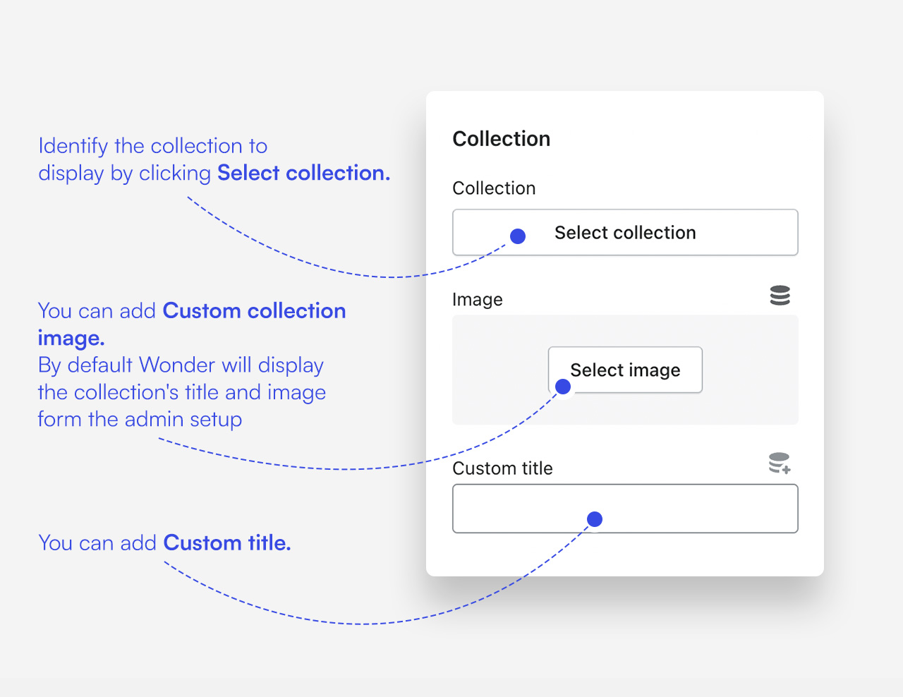
Customize collection blocks
Click one of the preloaded Collection blocks to customize it.
Mobile view example
Was this article helpful?
That’s Great!
Thank you for your feedback
Sorry! We couldn't be helpful
Thank you for your feedback
Feedback sent
We appreciate your effort and will try to fix the article