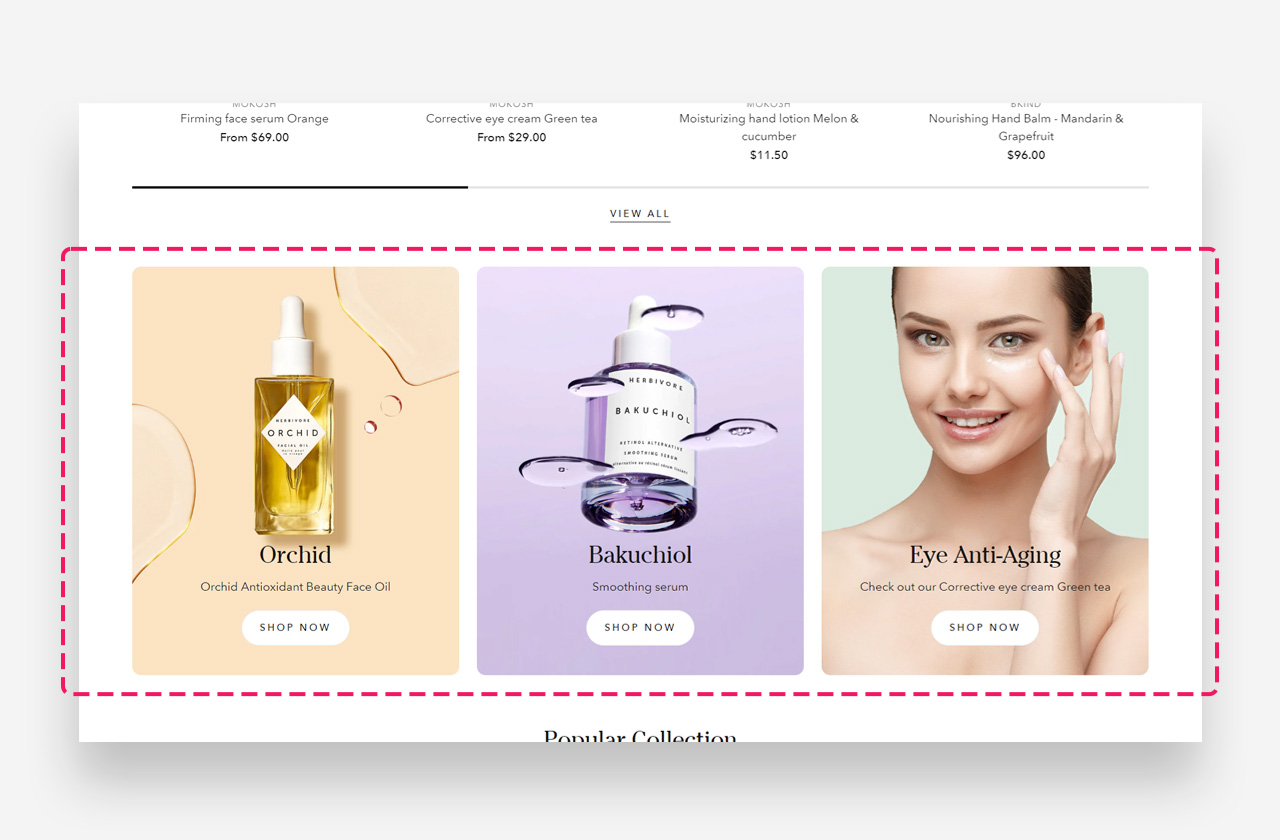
What is the Grid view section?
The "Grid view" section offers a neatly organized layout to present a series of images, products, or promotions. With its structured design, it provides a clear and consistent browsing experience for your customers.
Main Settings
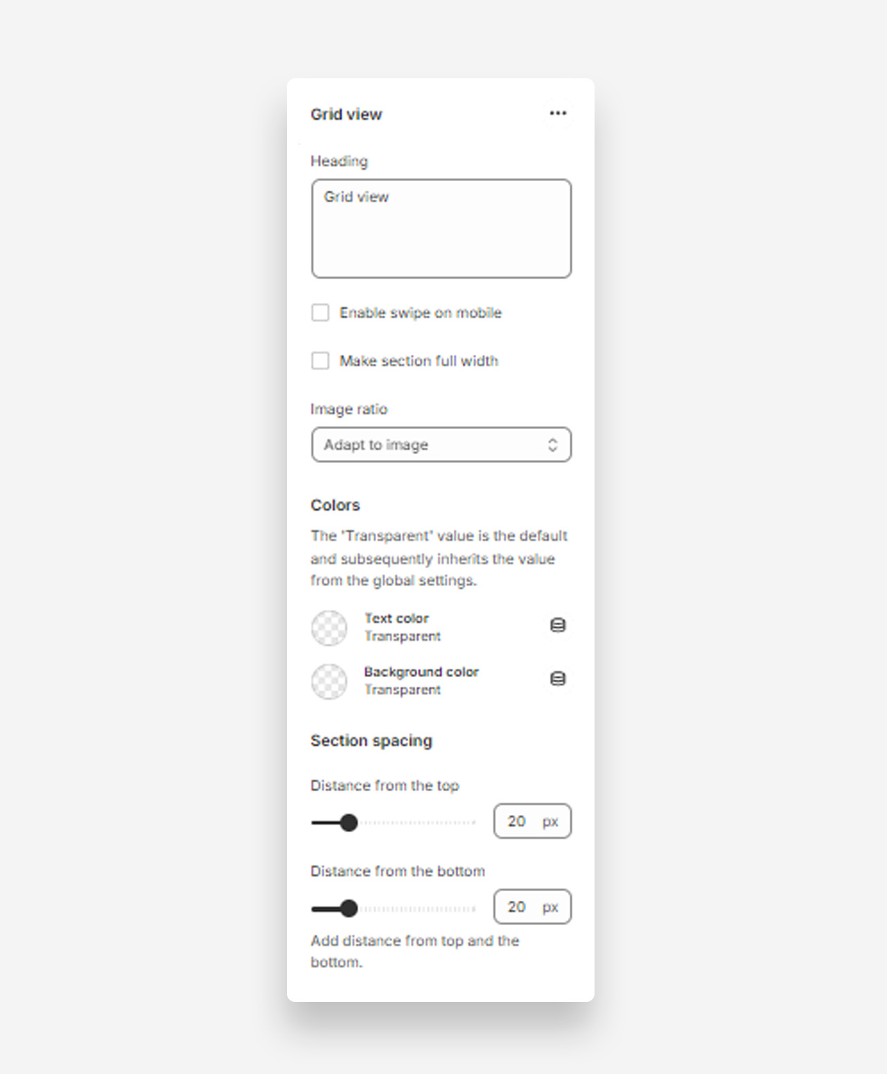
Heading
- Heading: Set the title for the grid view section to introduce the grid layout of products or content.
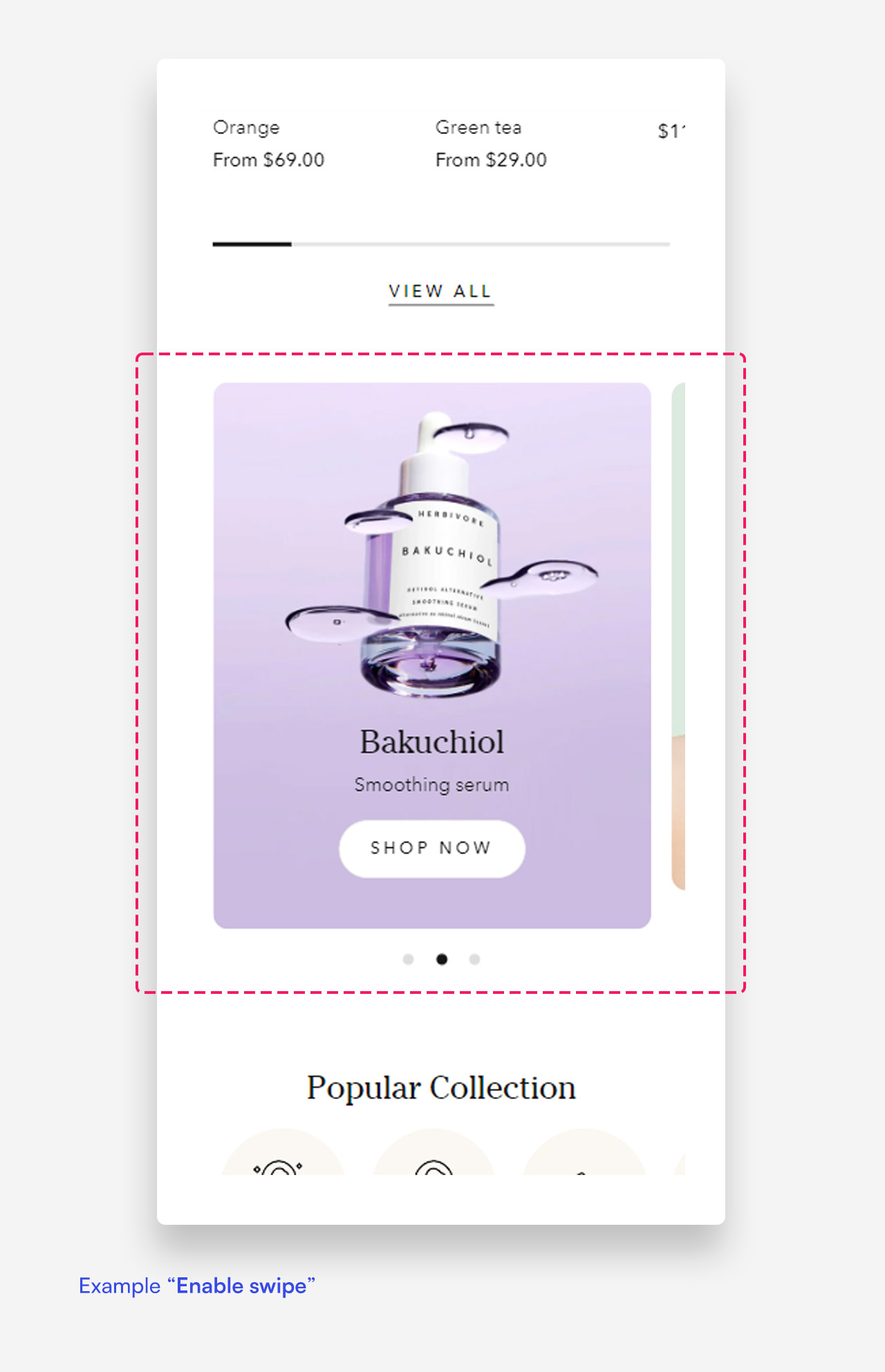
Enable Swipe on Mobile
- Enable swipe on mobile: Enable this setting to allow users to swipe through the grid view on mobile devices.
Make Section Full Width
- Make section full width: Enable this setting to make the grid view section span the full width of the container.
Image Ratio
- Image ratio: Select the image ratio for the grid view (e.g., Adapt to image).
Colors
- Text color: The 'Transparent' value is the default and subsequently inherits the value from the global settings.
- Background color: The 'Transparent' value is the default and subsequently inherits the value from the global settings.
Section Spacing
- Distance from the top: Adjust the spacing from the top of the section.
- Distance from the bottom: Adjust the spacing from the bottom of the section.
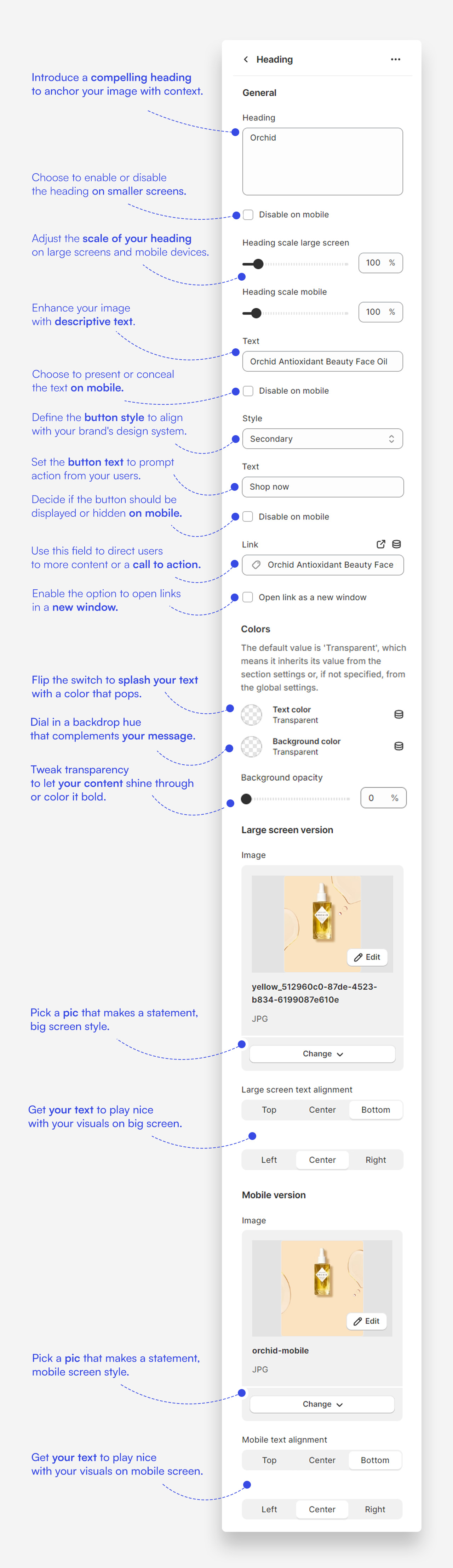
Customize column blocks
- Heading: Set a clear and concise title for the grid block that directs attention to the content.
- Text: Provide descriptive text to give more context or details about the image.
- Button: Include a call-to-action button, customizing the label and linking it to relevant pages or products.
- Heading Scale: Adjust the heading size for large screens and mobile devices to balance prominence with design.
- Image Selection: Upload an engaging image for both desktop and mobile versions that complements the block's content.
- Text Alignment: Align your text to the top, center, or bottom, and to the left, center, or right to enhance the layout's visual appeal.
- Custom Text Color: Select a color for the text to ensure it stands out against the background and the image.
- Background Color: Choose a background color and adjust its opacity to suit the overall design theme of the block.
- Disable on Mobile: If necessary, choose to disable the heading or text on mobile devices to streamline the presentation.
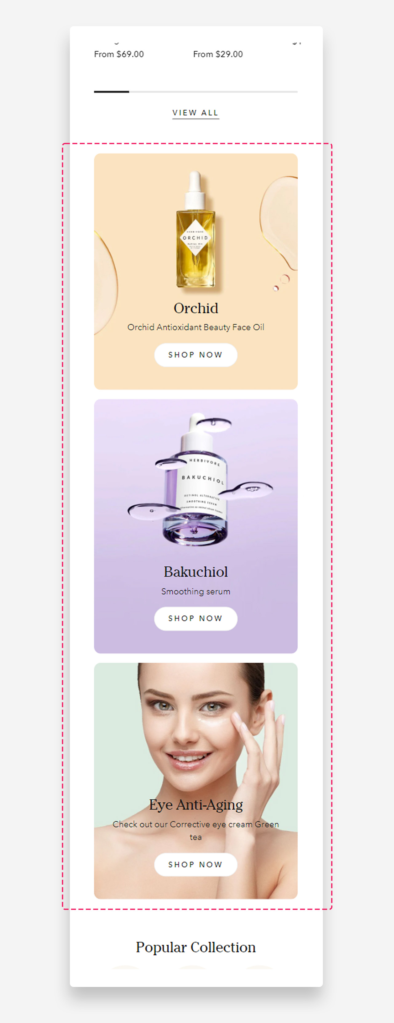
Mobile view example
Was this article helpful?
That’s Great!
Thank you for your feedback
Sorry! We couldn't be helpful
Thank you for your feedback
Feedback sent
We appreciate your effort and will try to fix the article